The Netherlands currently has more than 2 million people with one or more disabilities. With a digitally accessible website, culture becomes available to everyone, anytime, anywhere. The tips below are part of the 50 WCAG 2.1 requirements that an accessible website must meet.
To ensure that the internet becomes accessible to everyone, you can take several actions. No idea where to start making your website more accessible? Research agency Accessibility examines many websites for accessibility, including DEN.nl. We asked them what the most common mistakes are on the websites they test. Here are the 5 tips:
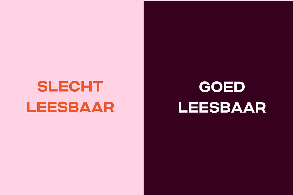
1. Add more contrast to improve readability
The use of certain color combinations can make it difficult for colorblind people to read the text. Therefore, a good contrast between the text and the background is important. Black text on a white background provides the highest contrast. But other color combinations can also work, as long as the contrast is at least 4.5:1. On the internet, you can find various websites, such as coolors.co, that indicate whether your color combinations have good enough contrast. Also, pay attention to text within images. WebAIM’s (opens in new tab) color contrast checker can also help you check contrasts.
2. Improve scanability by using headings
Someone who is visually impaired uses a screen reader to read online texts aloud. Users often first have all the headings read aloud to determine whether the content of the website is interesting to them. The screen reader reads the page from top to bottom, from heading to heading. Therefore, it is important that your pages are well-structured by using headings in a logical order. In the website's CMS, these are referred to as headings, H1, H2, H3, etc. By using these correctly, the webpage becomes more scannable for speech software.
For example, the structure of this page is built using headings:
H1 5 tips for an accessible website
H2 1. Add more contrast to improve readability
H2 2. Improve scanability by using headings
H2 3. Make images 'visible' with text
H2 4. Ensure forms are fillable
H2 5. Give pages and images a clear and unique name
3. Make images 'visible' with text
When uploading a photo to a page, you can add an alt-text to it. This text is also read aloud to the user by the speech software. By adding clear text, people with visual impairments can also 'see' the information. This is only necessary for images that add something to the text. For decorative images, leave out a caption or alt-text so that the image is not seen or read aloud by a screen reader.

4. Ensure forms are fillable
Many websites have forms, for example, to sign up for a newsletter or contact the organization. For forms, it is important that each input field either has a placeholder text in the input field or a label. This is something that often needs to be done by programmers or the external party providing the form.
Without labels or placeholder texts in the fields, navigating through a form becomes more difficult because it is unclear what needs to be filled in. Keyboard navigation and screen readers only focus on the input fields and do not see the text above them.

5. Give pages and images a clear and unique name
All links on a page are also tools for people with visual impairments to navigate your website. The screen reader can read out an overview of all the links on a page, allowing the user to scan the page more quickly for potentially relevant information. Therefore, it is important that links clearly indicate where they lead.
For example, 'information about us' is much clearer than just 'information,' and the user immediately knows where they are going. A link like 'Read more here' does not indicate what you will read further about. 'Read more about digital accessibility' is a better name for the link. For images, it is also important that they are named after the subject instead of, for example, 'screenshot x' or random letters and numbers.
Last updated February 1, 2024

By addressing these five points, you are already well on your way to making your website more accessible. If you want to be fully accessible, you must meet the 50 accessibility requirements set by the government, the WCAG 2.1 requirements. Read more about this in the article Digital Accessibility, Necessity, and Legislation.
Accessibility of den.nl
In May 2023, research agency Accessibility conducted a technical study commissioned by DEN. The website was tested for accessibility. We also conducted user tests, which revealed additional improvement points. Currently, our site has an accessibility label B. We are continuously improving our site in terms of accessibility.

More articles per topic